ToolTip & Validation UI customization
Available in Html5 Renderer version 1.0.5.7+
Validation/tooltip message boxes can be customized. Default design and behaviour is stored inside eForms.ValidationMessage API function. Change "eForms.ValidationMessage.Show()" and "eForms.ValidationMessage.Hide()" in order to change design of the validation message. Custom validation box will be created on position [0,0] of the current element with auto created z-index value and css class eformsValidationMsg.
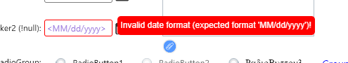
Default validation message design:
eForms.ValidationMessage & eForms.ToolTipMessage
| Function | Description |
| Show() | Shows custom validation message. This function will be called on the event that was set by eforms.ValidationMessage.ShowOnEvent. |
| Hide() | Hides custom validation message. This function will be called on the event that was set by eforms.ValidationMessage.HideOnEvent. |
Available events for ShowOnEvent & HideOnEvent string variables:
- "focus"
- "unfocus"
- "mouseenter"
- "mouseleave"
Defaults
| Public variable | Default value |
| ShowOnEvent | "focus" |
| HideOnEvent | "unfocus" |
Object GET properties
These properties are SET by the renderer before Show() function is called.
| Property | Description |
| container | selected JavaScript DOM element object of the generated container. |
| id | Id of thecurrent generated container. |
| msg | Current tooltip message that was created inside the Designer. (ToolTip property from designer) |
| x | X position of the current element (property from designer) |
| y | Y position of the current element (property from designer) |
| width | Width of the current element (property from designer) |
| height | Height of the current element (property from designer) |
| offsetX | Current X offset of the element. This offset contains value of all style margins, borders etc. for current DOM scope. |
| offsetY | Current Y offset of the element. This offset contains value of all style margins, borders etc. for current DOM scope. |
eForms.ValidationMessage.ShowOnEvent = 'mouseenter';
eForms.ValidationMessage.HideOnEvent = 'mouseleave';
eForms.ValidationMessage.Show = function () {
	let el = eForms.element;
	let container = el.container;
	container.style.top = el.y - 5 - 50 + 'px';
	container.style.left = el.x + 'px';
	container.style.zIndex = '2000';

	el.container.innerHTML = 'Input not valid! bacause:
' + el.msg;
}
Validation message design after changes:
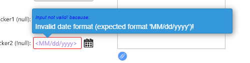
CSS pseudo-elements (::before & ::after) was used for demonstration purpose because they can not be created by JavaScript. So... They must be added inside webpage itself (CSS file or inside style tags). In this example, they are used for the little bottom arrow.
The message box will be shown on the MouseEnter event.
Text "Input not valid! bacause: " can be localized by localization function OnJSLocalization.
.eformsValidationMsg:after
{
	content: "";
	position: absolute;
	bottom: -25px;
	left: 21px;
	border-style: solid;
	border-width: 9px 9px 0;
	border-color: #3498DB transparent;
	display: block;
	width: 0;
	z-index: 1;
	top: 48px;
}

.eformsValidationMsg:before
{
	content: "";
	position: absolute;
	top: 48px;
	left: 20px;
	border-style: solid;
	border-width: 10px 10px 0;
	border-color: #2980B9 transparent;
	display: block;
	width: 0;
	z-index: 0;
}
eForms.ToolTipMessage
Tooltip boxes are driven by browsers by default.
eForms.ToolTipMessage.Show = function () {
	let el = eForms.element;
	let container = el.container;
	container.style.top = el.y + el.height + 5 + 'px';
	container.style.left = el.x + 'px';
	container.style.display = 'inline-block';
	container.style.backgroundColor = '#fff';
	container.style.color = 'red';

	el.container.innerHTML = el.msg;
}
eForms.ToolTipMessage.ShowOnEvent was not set, so default value ("focus") will be used. HideOnEvent will be set default as well.
Result after changes:
Show()/Hide() functions are used AUTOMATICALLY inside the renderer but they can be used inside website code (eForms.ToolTipMessage.Show() etc.) or NDCode JS script calls as well.