This post describes some specific operations that are possible to do with the e-Form System's NDDataGrid; for example disabling/enabling specific cells or bind custom items to a combobox column.
Forms Factory documentation pages
Documentation is categorized into several sections and sub-sections. The main sections are covering topics about Designer application, Renderer and Server sub-systems. There is also the Samples and code snippets section for more complex examples.
e-Forms System Configuration
The configuration of the e-Forms System is represented by configuring parameters for the FormsHub and FormServer IIS applications. The configuration is stored in the GGConfig database in the Neurodot.Forms zone and can be modified via the "Microsoft CGG Configuration Tool" desktop application. Here is a list of the parameters.
TextBlock style change on foreign event
How to change styles & events of the label that is linked to text input by LabelFor.
Control Events in HTML5 Renderer
This article contains the list of all user controls' events in the e-Forms system supported by the HTML5 renderer.
How to get eForms framework component versions from the browser
With the working eForms renderer, it is possible to resolve versions of the all important components in the eForms infrastrucure by opening browser's developers tools (usually F12) and in the console run the following function: scriptVersion() The output will be similar to this: CanvasInput: 1.0.5.9 Helpers: 1.0.5.9 NDFormsClientI: 1.0.5.9 FormsHub versions: Neu ...
HTML5 Renderer website integration
How to integrate the HTML5 renderer inside web page

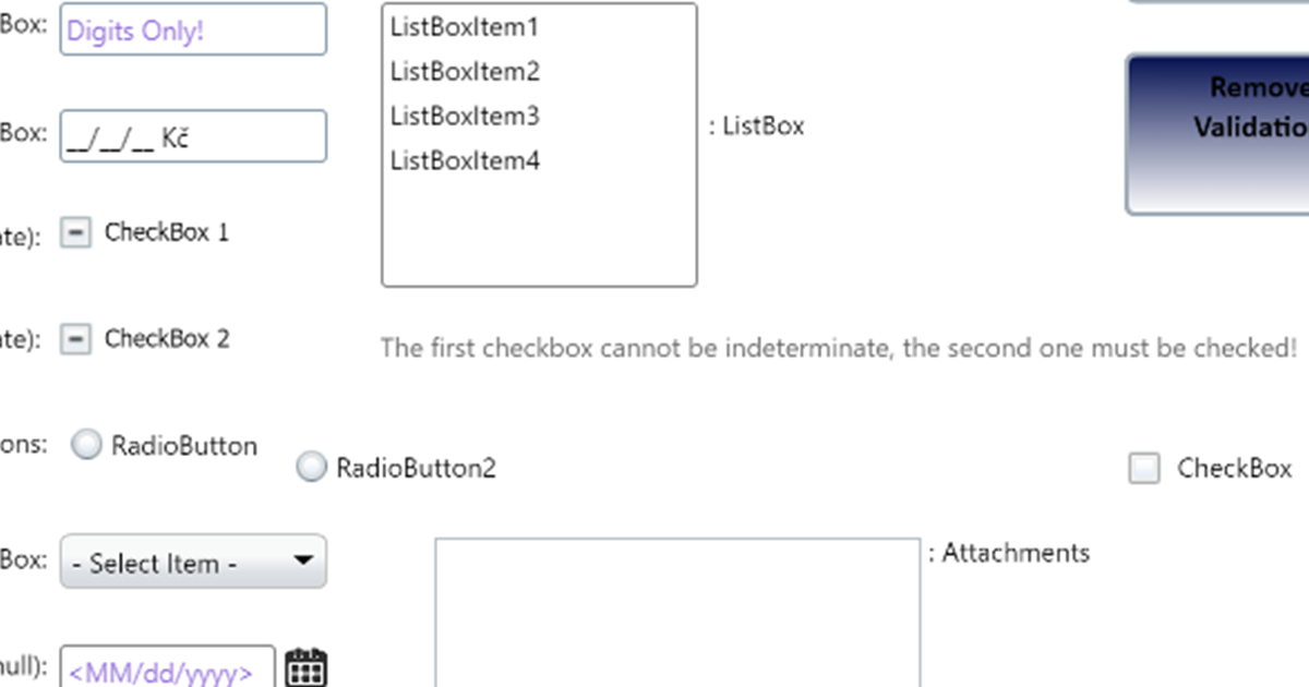
ToolTip & Validation UI customization
How to setup custom validation/tootlip boxes.
Font size conversion table
Designer uses pixels as a font size unit for user controls. If you are designing a form which uses points units, the conversion table bellow becomes handy. Point Pixel Default sans-serif 6pt 8px Sample 7pt 9px Sample 7.5pt 10px Sample 8pt 11px Sample 9pt 12px Sample 10pt 13px Sample 10.5pt 14px Sample ...
Rectangle
This user control represents a graphical element of the rectangle. Rectangle is defined in the Designer by its width, height, stroke thickness, color and fill. ...
Text Box
This control allows the user to enter a text values to forms. TextBox control can be used to display read-only copyable text or it can be used by users to input a text. The input can be a single line or an unlimited number of lines of text, depending on the setting of the control‘s properties. ...
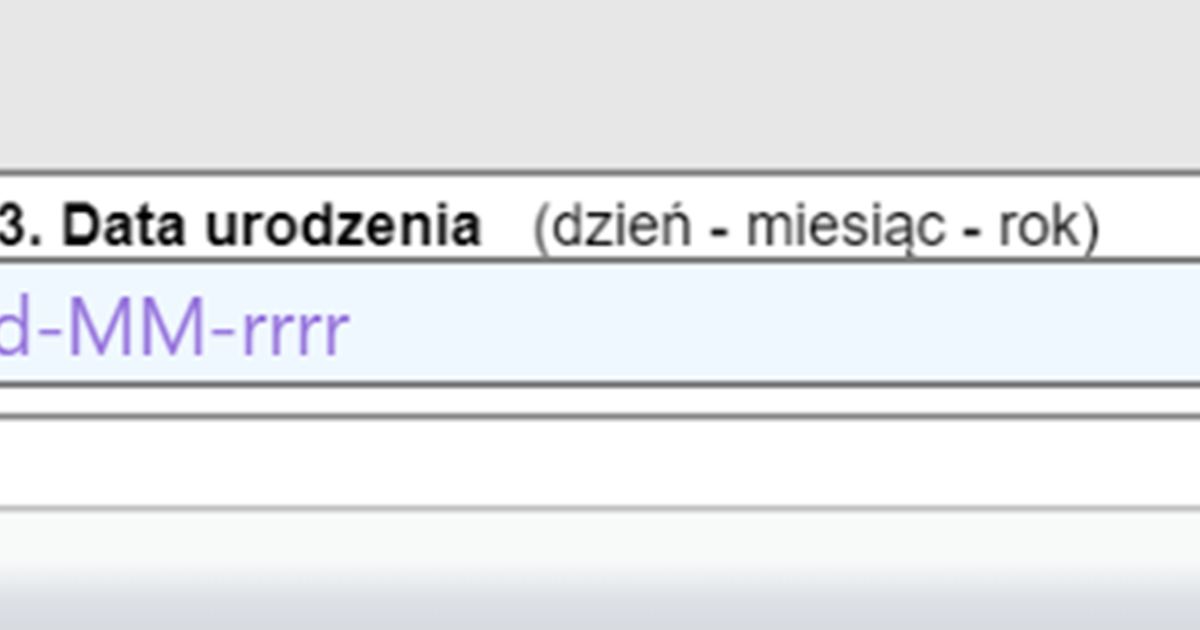
Masked Text Box
This control uses a mask to distinguish between proper and improper user input. For example: to force a user to fill out a date (e.g. a date of birth) in the masked text box a setting the property Mask to value of “90/90/0000” provides a text template for the user to type. Actual date value however should be validated by setting a regular expression validation. Mask ...